页面导航栏
大约 6 分钟
UIKit-React Native 集成文档
页面导航栏
TopNavigationBar 是一个灵活的导航栏组件,采用左-中-右三段式布局。聊天页面、会话列表页面、好友列表页面等均使用 TopNavigationBar。该组件支持完全自定义左侧、中部和右侧的子组件,让你可以根据业务需求灵活定制导航栏。
标题栏 TopNavigationBar
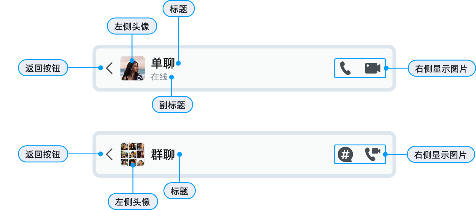
组件属性
TopNavigationBar 组件支持以下属性:
| 属性 | 类型 | 描述 |
|---|---|---|
Title | React.ReactElement | 中部标题组件 |
Left | React.ComponentType | React.ReactElement | 左侧组件 |
LeftProps | any | 传递给左侧组件的属性 |
Right | React.ComponentType | React.ReactElement | 右侧组件 |
RightProps | any | 传递给右侧组件的属性 |
containerStyle | StyleProp<ViewStyle> | 导航栏容器样式 |
预设组件
UIKit 提供了一系列预设快捷组件,开箱即用:
| 组件名 | 描述 |
|---|---|
TopNavigationBarTitle | 标准标题组件 |
TopNavigationBarLeft | 左侧返回按钮+文本组件 |
TopNavigationBarRight | 右侧单个图标按钮 |
TopNavigationBarRightList | 右侧多个图标按钮列表 |
TopNavigationBarRightTextList | 右侧文本按钮列表 |
会话列表页面
会话列表使用头像、标题和添加按钮(“+”):
import {
  TopNavigationBar,
  TopNavigationBarTitle,
  TopNavigationBarRight,
  StatusAvatar,
} from 'react-native-chat-uikit';

<TopNavigationBar
  Left={
    <StatusAvatar
      url={avatarUrl}
      size={32}
      userId={userId}
      onClicked={onClickedAvatar}
    />
  }
  Title={<TopNavigationBarTitle text="_uikit_navi_title_chat" />}
  Right={TopNavigationBarRight}
  RightProps={{
    iconName: 'plus_in_circle',
    onClicked: onShowMoreActions,
  }}
/>
好友列表
好友列表使用头像、标题和添加好友按钮:
<TopNavigationBar
  Left={
    <StatusAvatar
      url={avatarUrl}
      size={32}
      userId={userId}
      onClicked={onClickedAvatar}
    />
  }
  Title={<TopNavigationBarTitle text="_uikit_navi_title_contact" />}
  Right={TopNavigationBarRight}
  RightProps={{
    iconName: 'person_add',
    onClicked: onClickedNewContact,
  }}
/>
创建群组页面导航栏
使用左侧返回按钮和右侧文本按钮:
<TopNavigationBar
  Left={
    <TopNavigationBarLeft
      onBack={onBack}
      content="_uikit_create_group_title"
    />
  }
  Right={TopNavigationBarRightTextList}
  RightProps={{
    textList: [`创建(${selectedCount})`],
    onClickedList: [onClickedCreateGroup],
  }}
  Title={<TopNavigationBarTitle text="" />}
/>
右侧多图标按钮
使用 TopNavigationBarRightList 显示多个操作按钮:
<TopNavigationBar
  Title={<TopNavigationBarTitle text="聊天设置" />}
  Right={TopNavigationBarRightList}
  RightProps={{
    iconNameList: ['bell', 'person_add'],
    onClickedList: [
      onClickedNotification,
      onClickedAddMember,
    ],
  }}
/>
自定义组件
导航栏 TopNavigationBar 支持完全替换左、中、右任意区域的组件,而不仅仅是修改属性。
自定义左侧组件
将左侧组件替换为自定义的头像+状态组件:
// 自定义左侧组件
const CustomLeftComponent = () => {
  return (
    <View style={{ flexDirection: 'row', alignItems: 'center' }}>
      <Image
        source={{ uri: avatarUrl }}
        style={{ width: 36, height: 36, borderRadius: 18 }}
      />
      <View style={{ marginLeft: 8 }}>
        <Text style={{ fontSize: 14, fontWeight: 'bold' }}>用户名</Text>
        <Text style={{ fontSize: 12, color: 'green' }}>在线</Text>
      </View>
    </View>
  );
};

// 使用自定义组件
<TopNavigationBar
  Left={<CustomLeftComponent />}
  Title={<TopNavigationBarTitle text="聊天" />}
  Right={TopNavigationBarRight}
  RightProps={{
    iconName: 'ellipsis',
    onClicked: onShowMenu,
  }}
/>
自定义标题组件
将中部标题组件替换为自定义组件,支持副标题:
// 自定义标题组件
const CustomTitleComponent = ({ title, subtitle }: { title: string; subtitle?: string }) => {
  return (
    <View style={{ alignItems: 'center' }}>
      <Text style={{ fontSize: 18, fontWeight: 'bold' }}>{title}</Text>
      {subtitle && (
        <Text style={{ fontSize: 12, color: '#666' }}>{subtitle}</Text>
      )}
    </View>
  );
};

// 使用自定义标题
<TopNavigationBar
  Left={<BackButton onPress={onBack} />}
  Title={<CustomTitleComponent title="张三" subtitle="在线" />}
  Right={TopNavigationBarRight}
  RightProps={{
    iconName: 'ellipsis',
    onClicked: onShowMenu,
  }}
/>
自定义右侧组件
创建带徽标的通知按钮:
// 自定义右侧组件
const NotificationButton = ({ count, onPress }: { count: number; onPress: () => void }) => {
  return (
    <Pressable onPress={onPress} style={{ padding: 8 }}>
      <View>
        <Icon name="bell" style={{ width: 24, height: 24 }} />
        {count > 0 && (
          <View style={{
            position: 'absolute',
            top: -4,
            right: -4,
            backgroundColor: 'red',
            borderRadius: 10,
            minWidth: 20,
            height: 20,
            justifyContent: 'center',
            alignItems: 'center',
          }}>
            <Text style={{ color: 'white', fontSize: 12 }}>{count}</Text>
          </View>
        )}
      </View>
    </Pressable>
  );
};

// 使用自定义组件
<TopNavigationBar
  Title={<TopNavigationBarTitle text="消息" />}
  Right={<NotificationButton count={5} onPress={onClickedNotification} />}
/>
完全自定义导航栏
如果预设布局不满足需求,可以完全替换整个导航栏:
// 完全自定义的导航栏
const CustomNavigationBar = () => {
  return (
    <View style={{
      height: 60,
      flexDirection: 'row',
      justifyContent: 'space-between',
      alignItems: 'center',
      paddingHorizontal: 16,
      backgroundColor: '#f5f5f5',
    }}>
      <View style={{ flexDirection: 'row', alignItems: 'center' }}>
        <BackButton />
        <Image source={{ uri: groupAvatar }} style={{ width: 40, height: 40, borderRadius: 20, marginLeft: 12 }} />
        <View style={{ marginLeft: 12 }}>
          <Text style={{ fontSize: 16, fontWeight: 'bold' }}>开发组</Text>
          <Text style={{ fontSize: 12, color: '#999' }}>5人在线</Text>
        </View>
      </View>
      <View style={{ flexDirection: 'row' }}>
        <IconButton iconName="videocam" onPress={onVideoCall} />
        <IconButton iconName="call" onPress={onAudioCall} />
        <IconButton iconName="ellipsis" onPress={onShowMenu} />
      </View>
    </View>
  );
};

// 替换整个导航栏
<CustomNavigationBar />
设置导航栏样式
设置导航栏背景色
通过 containerStyle 属性自定义样式:
<TopNavigationBar
  Title={<TopNavigationBarTitle text="消息" />}
  containerStyle={{
    // 背景色
    backgroundColor: '#007AFF',
    // 高度
    height: 56,
  }}
/>
设置导航栏高度
<TopNavigationBar
  Title={<TopNavigationBarTitle text="消息" />}
  containerStyle={{
    height: 60,
    paddingHorizontal: 16,
  }}
/>
添加底部边框
<TopNavigationBar
  Title={<TopNavigationBarTitle text="消息" />}
  containerStyle={{
    borderBottomWidth: 1,
    borderBottomColor: '#e0e0e0',
  }}
/>
页面集成示例
会话列表页面
- 使用默认导航栏:
import { ConversationList } from 'react-native-chat-uikit';

function ConversationListScreen() {
  return (
    <ConversationList
      navigationBarVisible={true}  // 显示默认导航栏
    />
  );
}
- 自定义会话列表导航栏:
<ConversationList
  navigationBarVisible={true}
  customNavigationBar={
    <TopNavigationBar
      Left={<MyCustomAvatar />}
      Title={<TopNavigationBarTitle text="我的消息" />}
      Right={TopNavigationBarRightList}
      RightProps={{
        iconNameList: ['search', 'plus_in_circle'],
        onClickedList: [onSearch, onNewChat],
      }}
    />
  }
/>
聊天页面
单聊导航栏:
<TopNavigationBar
  Left={
    <Pressable
      style={{ flexDirection: 'row', alignItems: 'center' }}
      onPress={onBack}
    >
      <BackButton />
      <StatusAvatar
        url={convAvatar}
        size={32}
        userId={convId}
        onClicked={onClickedAvatar}
      />
      <View style={{ marginLeft: 10 }}>
        <View style={{ flexDirection: 'row', alignItems: 'center' }}>
          <Text style={{ fontSize: 16, fontWeight: '500' }}>
            {convName ?? convId}
          </Text>
          {doNotDisturb && (
            <Icon name="bell_slash" style={{ width: 20, height: 20, marginLeft: 4 }} />
          )}
        </View>
        {/* 显示在线状态或正在输入 */}
        {messageTyping ? (
          <Text style={{ fontSize: 12, color: '#666' }}>正在输入...</Text>
        ) : status ? (
          <Text style={{ fontSize: 12, color: '#666' }}>{status}</Text>
        ) : null}
      </View>
    </Pressable>
  }
  Right={TopNavigationBarRightList}
  RightProps={{
    iconNameList: ['phone_pick', 'video_camera'],
    onClickedList: [onClickedVoice, onClickedVideo],
  }}
/>
群聊导航栏(带话题):
<TopNavigationBar
  Left={
    <Pressable
      style={{ flexDirection: 'row', alignItems: 'center' }}
      onPress={onBack}
    >
      <BackButton />
      <GroupAvatar url={convAvatar} size={32} />
      <View style={{ marginLeft: 10 }}>
        <View style={{ flexDirection: 'row', alignItems: 'center' }}>
          <Text style={{ fontSize: 16, fontWeight: '500' }}>
            {convName ?? convId}
          </Text>
          {doNotDisturb && (
            <Icon name="bell_slash" style={{ width: 20, height: 20 }} />
          )}
        </View>
      </View>
    </Pressable>
  }
  Right={TopNavigationBarRightList}
  RightProps={{
    iconNameList: ['pin_2', 'hashtag_in_bubble_fill', 'phonen_camera'],
    onClickedList: [
      onClickedPinMessage,    // 置顶消息
      onClickedThread,        // 话题频道
      onClickedAV,            // 音视频会议
    ],
  }}
/>
话题详情页面导航栏
<TopNavigationBar
  Left={
    <Pressable
      style={{ flexDirection: 'row', alignItems: 'center' }}
      onPress={onBack}
    >
      <BackButton />
      <View style={{ marginLeft: 10 }}>
        <Text style={{ fontSize: 16, fontWeight: '500' }}>
          {threadName ?? threadId}
        </Text>
        <Text style={{ fontSize: 12, color: '#666' }}>
          #{parentName}
        </Text>
      </View>
    </Pressable>
  }
  Right={TopNavigationBarRightList}
  RightProps={{
    iconNameList: ['ellipsis_vertical'],
    onClickedList: [onClickedThreadMore],
  }}
/>
多选模式导航栏
<TopNavigationBar
  Left={
    <Pressable style={{ flexDirection: 'row', alignItems: 'center' }}>
      <GroupAvatar url={convAvatar} size={32} />
      <Text style={{ marginLeft: 10, fontSize: 16 }}>
        {convName ?? convId}
      </Text>
    </Pressable>
  }
  Right={TopNavigationBarRightTextList}
  RightProps={{
    textList: ['取消'],
    onClickedList: [onCancelMultiSelected],
  }}
/>
好友列表页面
根据 contactType 显示不同导航栏样式:
// contactType: 'contact-list' - 好友列表
<TopNavigationBar
  Left={<StatusAvatar url={avatarUrl} size={32} userId={userId} />}
  Title={<TopNavigationBarTitle text="_uikit_navi_title_contact" />}
  Right={TopNavigationBarRight}
  RightProps={{
    iconName: 'person_add',
    onClicked: onClickedNewContact,
  }}
/>

// contactType: 'create-group' - 创建群组
<TopNavigationBar
  Left={<TopNavigationBarLeft onBack={onBack} content="_uikit_create_group_title" />}
  Right={TopNavigationBarRightTextList}
  RightProps={{
    textList: [`创建(${selectedCount})`],
    onClickedList: [onClickedCreateGroup],
  }}
  Title={<TopNavigationBarTitle text="" />}
/>

// contactType: 'new-conversation' - 新建会话
<TopNavigationBar
  Left={
    <Pressable onPress={onBack}>
      <Text>取消</Text>
    </Pressable>
  }
  Title={<TopNavigationBarTitle text="_uikit_new_conv_title" />}
  Right={<View style={{ width: 32, height: 32 }} />}
/>
常见问题
如何隐藏默认导航栏?
在页面组件中设置 navigationBarVisible={false}:
<ConversationList navigationBarVisible={false} />
如何修改标题文字颜色?
自定义 Title 组件:
const CustomTitle = ({ text }: { text: string }) => {
  return (
    <Text style={{ fontSize: 18, color: 'white', fontWeight: 'bold' }}>
      {text}
    </Text>
  );
};

<TopNavigationBar
  Title={<CustomTitle text="消息" />}
  containerStyle={{ backgroundColor: '#007AFF' }}
/>
左中右组件的布局比例如何?
默认布局为:
- 左侧:自适应宽度
- 中部:剩余空间,居中对齐
- 右侧:自适应宽度
如果左侧组件过宽,可能会挤压中部标题。可通过设置左侧组件的固定宽度来避免:
<View style={{ width: 120 }}>  {/* 限制左侧宽度 */}
  <CustomLeftComponent />
</View>
如何添加渐变背景?
使用 LinearGradient 组件:
import LinearGradient from 'react-native-linear-gradient';

<LinearGradient
  colors={['#667eea', '#764ba2']}
  start={{ x: 0, y: 0 }}
  end={{ x: 1, y: 0 }}
  style={{ height: 44 }}
>
  <TopNavigationBar
    Title={<TopNavigationBarTitle text="消息" />}
    containerStyle={{ backgroundColor: 'transparent' }}
  />
</LinearGradient>
如何实现滚动渐变导航栏?
结合 Animated 和 ScrollView 的滚动事件实现:
const [opacity, setOpacity] = useState(0);

<Animated.View style={{ opacity }}>
  <TopNavigationBar
    Title={<TopNavigationBarTitle text="消息" />}
  />
</Animated.View>

<ScrollView
  onScroll={(e) => {
    const offsetY = e.nativeEvent.contentOffset.y;
    const newOpacity = Math.min(offsetY / 100, 1);
    setOpacity(newOpacity);
  }}
  scrollEventThrottle={16}
>
  {/* 内容 */}
</ScrollView>