消息列表设置
大约 6 分钟
UIKit-Web 集成文档
消息列表设置
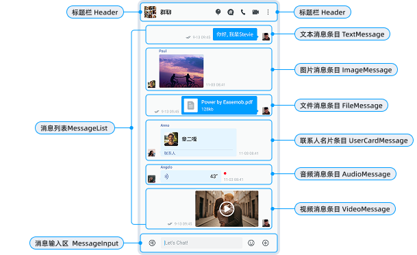
消息列表是聊天界面的核心组件,基于 MessageList 组件实现。本文介绍如何通过 Chat 组件的 messageListProps 实现消息列表和消息条目的设置。
聊天页面 Chat
概述
Chat 组件提供了 messageListProps 属性,方便开发者进行一些自定义设置,目前提供的设置项如下:
<Chat
  messageListProps={{
    // 使用 customRenderers API 自定义渲染消息
    customRenderers: {
      txt: ctx => <CustomTextMessage message={ctx.message} />,
    },
    // 自定义用户信息渲染
    renderUserProfile: props => <CustomUserProfile {...props} />,
    // 消息属性配置
    messageProps: {
      // 自定义操作菜单
      customAction: {
        visible: true,
        actions: [
          { content: 'FORWARD' },
          { content: 'REPLY' },
          { content: 'UNSEND' },
          // ...
        ],
      },
      // 消息时间格式化
      formatDateTime: time => new Date(time).toLocaleString(),
      // 其他配置...
    },
  }}
/>
设置消息列表背景
你可以通过以下两种方式设置消息列表的背景:
- 通过
Chat组件的className和style属性设置:
<Chat
  className="custom-chat"
  style={{
    backgroundImage: 'url(/path/to/background.jpg)',
    backgroundSize: 'cover',
    backgroundPosition: 'center',
  }}
/>
- 使用 CSS 类设置:
.custom-chat {
  background-image: url(/path/to/background.jpg);
  background-size: cover;
  background-position: center;
}
设置消息列表空页面
通过 Chat 组件的 renderEmpty 属性可以自定义空内容组件:
<Chat
  renderEmpty={() => (
    <div className="empty-chat">
      <p>暂无消息</p>
    </div>
  )}
/>
设置消息条目
对于消息条目,你可以进行自定义设置,例如:
- 完全自定义消息条目
- 设置默认的头像和昵称及其样式
- 设置消息气泡
- 设置消息日期

设置头像和昵称
关于使用自己的头像和昵称,详见 GitHub 文档说明。
你可以通过 messageProps 设置点击头像显示的个人信息:
<Chat
  messageListProps={{
    messageProps: {
      // 自定义用户信息渲染
      renderUserProfile: props => {
        return (
          <div>
            <Avatar src={props.avatar} />
            <span>{props.nickname}</span>
          </div>
        );
      },
    },
  }}
/>
设置消息气泡
你可以通过以下两种方式设置消息气泡样式:

- 通过自定义消息组件设置:
import { TextMessage } from 'easemob-chat-uikit';

<Chat
  messageListProps={{
    customRenderers: {
      txt: ctx => (
        <TextMessage
          textMessage={ctx.message}
          bubbleStyle={{
            // 消息气泡背景
            background: '#your-color',
            // 消息气泡的圆角半径
            borderRadius: '8px',
          }}
          // 消息气泡的形状:square 为方形,round 为圆形。
          shape="square" // 或 "round"
        />
      ),
    },
  }}
/>;
- 通过 CSS 类名设置:
.cui-message-base-content {
  background: #your-color;
  border-radius: 8px;
}
设置消息时间
你可以设置消息的发送和接收时间的格式和样式。
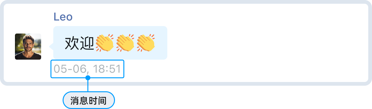
设置消息时间格式
<Chat
  messageListProps={{
    messageProps: {
      formatDateTime: (time: number) => {
        // 自定义显示日期和时间
        const date = new Date(time);
        const today = new Date();
        if (date.toDateString() === today.toDateString()) {
          return date.toLocaleTimeString('zh-CN', { hour: '2-digit', minute: '2-digit' });
        }
        return date.toLocaleString('zh-CN');
      },
    },
  }}
/>
设置消息时间样式
通过 CSS 类名自定义时间样式:
.cui-message-base-time {
  color: #999;
  font-size: 12px;
}
设置消息状态
- 设置隐藏消息状态:
<Chat
  messageListProps={{
    messageProps: {
      messageStatus: false
    },
  }}
/>
- 设置消息状态为文本或图标:
<Chat
  messageListProps={{
    messageProps: {
      messageStatusType: 'icon' // icon 或者 text
    },
  }}
/>
设置消息操作菜单
点击消息列表项旁边的 ⋮ 后要显示的消息操作按钮。支持复制、回复、转发、置顶、多选、翻译、创建话题等丰富功能。
你可以通过 messageProps.customAction 配置菜单项,包括添加和删除菜单项:
<Chat
  messageListProps={{
    messageProps: {
      customAction: {
        visible: true,
        icon: null,
        actions: [
          {
            // 展示单条转发
            content: 'FORWARD',
            onClick: () => {
              console.log('转发消息');
            },
          },
          {
            // 展示消息引用
            content: 'REPLY',
            onClick: () => {
              console.log('引用消息');
            },
          },
          {
            // 展示消息撤回
            content: 'UNSEND',
            onClick: () => {
              console.log('撤回消息');
            },
          },
          {
            // 展示消息编辑
            content: 'Modify',
            onClick: () => {
              console.log('编辑消息');
            },
          },
          {
            // 展示消息多选
            content: 'SELECT',
            onClick: () => {
              console.log('多选消息');
            },
          },
          {
            // 展示消息固定
            content: 'PIN',
            onClick: () => {
              console.log('固定消息');
            },
          },
          {
            // 展示消息翻译
            content: 'TRANSLATE',
            onClick: () => {
              console.log('翻译消息');
            },
          },
          {
            // 展示消息举报
            content: 'REPORT',
            onClick: () => {
              console.log('举报消息');
            },
          },
          {
            // 展示消息删除
            content: 'DELETE',
            onClick: () => {
              console.log('删除消息');
            },
          },
          {
            // 自定义按钮
            content: '自定义按钮',
            icon: <Icon type="STAR" />,
            onClick: () => {
              console.log('自定义操作');
            },
          },
        ],
      },
    },
  }}
/>
完全自定义消息条目
你可以使用 customRenderers 自定义消息条目的内容,即各种消息类型的自定义消息布局。
import { Chat, MessageList } from 'easemob-chat-uikit';

const CustomTextMessage = ({ message }) => {
  return (
    <div className="custom-text-message">
      <div>{message.msg}</div>
    </div>
  );
};

<Chat
  messageListProps={{
    customRenderers: {
      txt: ctx => <CustomTextMessage message={ctx.message} />,
      custom: ctx => {
        // 处理自定义消息类型
        if (ctx.message.customEvent === 'CARD') {
          return <CustomCardMessage message={ctx.message} />;
        }
        return null;
      },
    },
  }}
/>;
设置消息事件监听
通过 messageProps 可设置消息条目的各类交互事件监听:
<Chat
  messageListProps={{
    messageProps: {
      // 消息气泡点击事件
      onClick: message => {
        console.log('点击消息气泡', message);
      },
    },
  }}
/>
设置消息发送回调
你可以通过 messageInputProps 设置消息发送后回调和消息发送前回调监听。
<Chat
  messageInputProps={{
    // 消息发送后回调
    onSendMessage: message => {
      console.log('消息已发送', message);
    },
    // 消息发送前回调,返回 Promise,resolve 则发送,reject 则不发送
    onBeforeSendMessage: async message => {
      // 可以在这里添加扩展字段
      message.customExts = {
        ...message.customExts,
        customField: 'customValue',
      };
      return Promise.resolve();
    },
  }}
/>
可自定义的 CSS 类名
Chat 提供了以下主要的 CSS 类名。你可以通过覆盖这些类名来自定义样式:
| 类名 | 说明 |
|---|---|
.cui-chat | 聊天页面容器 |
.cui-messageList | 消息列表 |
.cui-messageList-msgItem | 消息条目 |
.cui-message-base-content | 消息气泡 |
.cui-message-base-time | 消息时间 |
.cui-message-editor | 消息输入容器 |
.cui-header | 标题栏 |
Chat 属性总览
| 参数 | 类型 | 描述 |
|---|---|---|
className | String | 组件的类名 |
prefix | String | CSS 类名前缀 |
style | React.CSSProperties | 组件的内联样式 |
headerProps | HeaderProps | Header 组件的参数 |
messageListProps | MsgListProps | MessageList 组件的参数 |
messageInputProps | MessageInputProps | MessageInput 组件的参数 |
renderHeader | (cvs: CurrentCvs) => React.ReactNode | 自定义渲染 Header 组件的方法 |
renderMessageList | () => ReactNode | 自定义渲染 MessageList 组件的方法 |
renderMessageInput | () => ReactNode | 自定义渲染 MessageInput 组件的方法 |
renderEmpty | () => ReactNode | 自定义渲染空内容组件的方法 |
renderRepliedMessage | (repliedMessage: ChatSDK.MessageBody | null) => ReactNode | 自定义渲染消息输入区上面的被回复的消息 |
useCallkit | boolean | 是否启用 CallKit,默认为 true |
callkitProps | Partial<CallKitProps> | CallKit 组件的配置参数 |
修改主题
Chat 组件提供了以下与聊天页面主题相关的 SCSS 变量,关于如何修改主题,参见 GitHub 主题文档。
$chat-bg: $component-background;
$msg-base-font-size: $font-size-lg;
$msg-base-color: $font-color;
$msg-base-margin: $margin-xs 0;
$msg-base-padding: 0 $padding-lg;
$msg-bubble-border-radius-left: 12px 16px 16px 4px;
$msg-bubble-border-radius-right: 16px 12px 4px 16px;
$msg-bubble-arrow-border-size: 6px;
$msg-bubble-arrow-bottom: 8px;
$msg-bubble-arrow-left: -11px;
$msg-bubble-arrow-right: -11px;
$msg-bubble-color-secondly: $blue-95;
$msg-bubble-color-primary: $blue-5;
$msg-bubble-font-color-secondly: $font-color;
$msg-bubble-font-color-primary: $gray-98;
$msg-base-content-margin: 0 $margin-xs 0 $margin-sm;
$msg-base-content-padding: $padding-xs $padding-sm;
$msg-base-content-minheight: 24px;
$msg-bubble-none-bg: transparent;
$msg-bubble-none-color: $font-color;
$msg-bubble-square-border-radius: 4px;
$msg-info-margin-left: $margin-sm;
$msg-nickname-font-size: $font-size-sm;
$msg-nickname-font-weight: 500;
$msg-nickname-font-color: #5270ad;
$msg-nickname-height: 16px;
$msg-time-font-size: $font-size-sm;
$msg-time-font-weight: 400;
$msg-time-font-color: $gray-7;
$msg-time-height: 16px;
$msg-time-margin: 0 $margin-xss;
$msg-time-width: 106px;