设置消息输入
大约 4 分钟
UIKit-Web 集成文档
设置消息输入
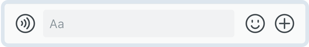
消息输入区 MessageInput 实现各种消息的输入、发送,可扩展至自定义消息类型(如名片消息等)、支持表情添加及常用功能扩展。
消息输入区 MessageInput
设置消息输入区背景
- 通过
messageInputProps设置:
<Chat
  messageInputProps={{
    style: {
      backgroundColor: '#f5f5f5',
    },
  }}
/>
- 使用 CSS 设置:
.cui-message-editor {
  background-color: #f5f5f5;
}
设置消息输入区功能
设置功能概述
你可以获取 MessageInput 组件,对消息输入区进行自定义操作:
import { Chat, MessageInput, Icon } from 'easemob-chat-uikit';

<Chat
  renderMessageInput={() => (
    <MessageInput
      // 配置消息输入区的功能
      actions={[
        {
          name: 'RECORDER', // 发送语音功能
          visible: true,
        },
        {
          name: 'TEXTAREA', // 消息输入框
          visible: true,
        },
        {
          name: 'EMOJI', // 表情
          visible: true,
        },
        {
          name: 'MORE', // 更多操作
          visible: true,
        },
      ]}
      // 是否启用正在输入功能
      enabledTyping={true}
      // 是否展示发送按钮
      showSendButton={true}
      // 发送按钮 Icon
      sendButtonIcon={<Icon type="AIR_PLANE" />}
      // 文本框中的输入行数
      row={1}
      // 默认占位符
      placeHolder="请输入内容"
      // 是否开启@功能
      enabledMention={true}
      // 发送消息的回调
      onSendMessage={message => {
        console.log('发送消息', message);
      }}
      // 消息发送前回调
      onBeforeSendMessage={async message => {
        // 可以添加扩展字段
        message.customExts = {
          ...message.customExts,
          customField: 'customValue',
        };
        return Promise.resolve();
      }}
    />
  )}
/>;
设置文本输入框默认文本
可通过 MessageInput 的 placeHolder 属性设置文本输入框中的占位文本:
<Chat
  messageInputProps={{
    placeHolder: '请输入消息内容',
  }}
/>
监听输入内容变化
<Chat
  messageInputProps={{
    onChange: value => {
      console.log('输入内容变化', value);
    },
    onFocus: () => {
      console.log('输入框获得焦点');
    },
  }}
/>
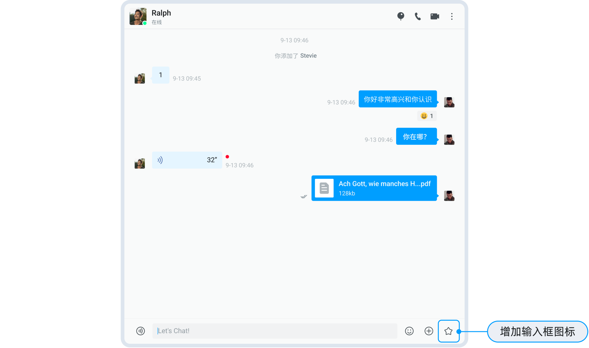
添加自定义图标
在消息输入区中添加自定义图标,实现指定的功能:
- 使用
renderMessageInput方法自定义渲染消息输入区。 - 使用
actions自定义MessageInput组件。
import React from 'react';
import { Chat, Icon, MessageInput } from 'easemob-chat-uikit';
import 'easemob-chat-uikit/style.css';

const ChatContainer = () => {
  // 自定义要添加的图标
  const CustomIcon = {
    visible: true,
    name: 'CUSTOM',
    icon: (
      <Icon
        type="DOC"
        onClick={() => {
          console.log('click custom icon');
        }}
      ></Icon>
    ),
  };

  const actions = [...MessageInput.defaultActions];
  // 在消息输入框中添加图标
  actions.splice(2, 0, CustomIcon);
  return (
    <div style={{ width: '70%', height: '100%' }}>
      <Chat renderMessageInput={() => <MessageInput actions={actions} />} />
    </div>
  );
};
消息输入区中添加图标
管理表情菜单
表情菜单通过 MessageInput 组件的 actions 配置中的 EMOJI 项来控制显示/隐藏。表情数据由 UIKit 内部管理,你可以通过自定义渲染来扩展表情功能。
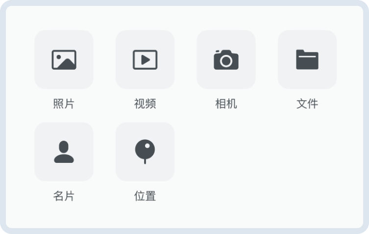
设置扩展菜单
消息输入区的扩展菜单提供发送附件类型消息(如图片、视频、文件)、位置消息以及自定义消息的快捷入口。点击消息输入区中的扩展图标(默认为加号)会弹出扩展菜单。
消息扩展菜单
管理菜单项
你可以通过 MessageInput 的 customActions 来动态管理扩展菜单项:
import { Chat, MessageInput, Icon } from 'easemob-chat-uikit';

<Chat
  renderMessageInput={() => (
    <MessageInput
      customActions={[
        {
          content: 'IMAGE',
          icon: <Icon type="IMAGE" />,
          onClick: () => {
            console.log('选择图片');
          },
        },
        {
          content: 'VIDEO',
          icon: <Icon type="VIDEO" />,
          onClick: () => {
            console.log('选择视频');
          },
        },
        {
          content: 'FILE',
          icon: <Icon type="FILE" />,
          onClick: () => {
            console.log('选择文件');
          },
        },
        {
          content: 'CARD',
          icon: <Icon type="CARD" />,
          onClick: () => {
            console.log('发送名片');
          },
        },
        {
          // 自定义菜单项
          content: 'CUSTOM',
          icon: <Icon type="STAR" />,
          onClick: () => {
            console.log('自定义操作');
          },
        },
      ]}
    />
  )}
/>;
实现发送自定义消息
- 使用
messageStore中提供的sendMessage方法发送自定义消息。 - 使用
renderMessage渲染自定义消息。
提示
为了保证消息在当前会话中展示,消息中的 to 字段必须是对方的用户 ID 或者群组的 ID。
import React from "react";
import {
  Chat,
  MessageList,
  TextMessage,
  rootStore,
  MessageInput,
  Icon,
} from "easemob-chat-uikit";
import "easemob-chat-uikit/style.css";

const ChatContainer = () => {
  // 展示自定义消息
  const renderCustomMsg = (msg) => {
    return (
      <div>
        <h1>Business Card </h1>
        <div>{msg.customExts.id}</div>
      </div>
    );
  };
  const renderMessage = (msg) => {
    if (msg.type === "custom") {
      return renderCustomMsg(msg);
    }
  };

  // 在消息输入框中添加图标
  const CustomIcon = {
    visible: true,
    name: "CUSTOM",
    icon: (
      <Icon
        type="DOC"
        onClick={() => {
          sendCustomMessage();
        }}
      ></Icon>
    ),
  };
  const actions = [...MessageInput.defaultActions];
  actions.splice(2, 0, CustomIcon);

  // 实现发送自定义消息
  const sendCustomMessage = () => {
    const customMsg = ChatSDK.message.create({
      type: "custom",
      to: "targetId", //消息接收方:单聊为对端用户 ID,群聊为群组 ID。
      chatType: "singleChat",
      customEvent: "CARD",
      customExts: {
        id: "userId3",
      },
    });
    rootStore.messageStore.sendMessage(customMsg).then(() => {
      console.log("send success");
    });
  };
  return (
    <div style={{ width: "70%", height: "100%" }}>
      <Chat
        renderMessageList={() => <MessageList renderMessage={renderMessage} />}
        renderMessageInput={() => <MessageInput actions={actions} />}
      />
    </div>
  );
};
自定义消息
自定义样式
关于聊天页面的消息输入区的自定义样式,详见 聊天页面自定义说明。