消息列表的高级设置
消息列表的高级设置
消息列表是聊天界面的核心组件,基于 ChatUIKitMessageListLayout 实现。本文介绍如何通过 ChatUIKitMessageListLayout 实现消息列表的高级设置。
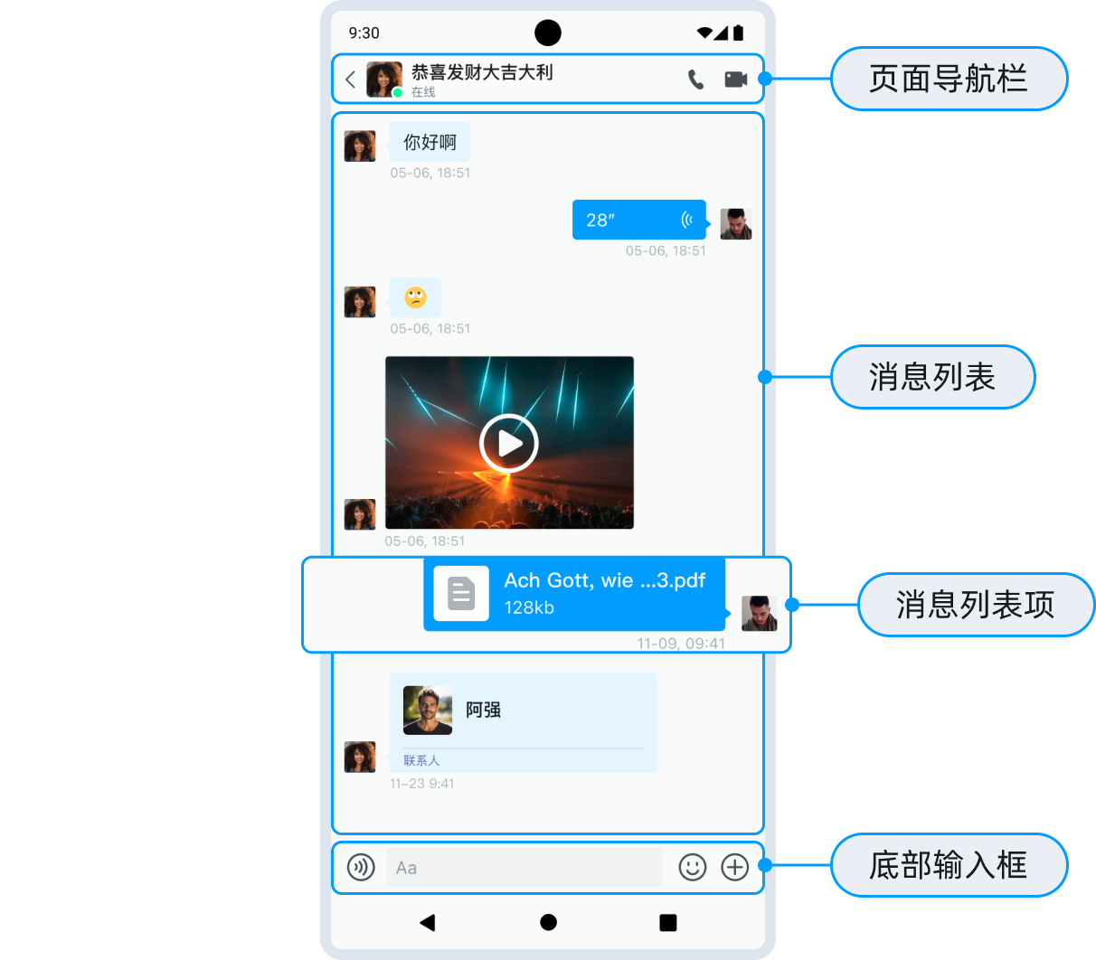
概述
你可以通过 ChatUIKitMessageListLayout 设置消息列表:
val chatMessageListLayout:ChatUIKitMessageListLayout? = binding?.layoutChat?.chatMessageListLayout
ChatUIKitMessageListLayout 提供如下方法:
| 方法 | 描述 |
|---|---|
setViewModel() | UIKit 中提供了默认的实现 ChatUIKitMessageListViewModel,开发者可以继承 IChatMessageListRequest 添加自己的数据逻辑。 |
setMessagesAdapter() | 设置消息列表的适配器,需要是 ChatUIKitMessagesAdapter 的子类。 |
getMessagesAdapter() | 返回消息列表的适配器。 |
addHeaderAdapter() | 添加消息列表的头布局的适配器。 |
addFooterAdapter() | 添加消息列表的尾布局的适配器。 |
removeAdapter() | 移除指定适配器。 |
addItemDecoration() | 添加消息列表的装饰器。 |
removeItemDecoration() | 移除消息列表的装饰器。 |
setAvatarDefaultSrc() | 设置消息条目的默认头像。 |
setAvatarShapeType() | 设置头像的样式,分为默认样式,圆形和矩形三种样式。 |
showNickname() | 是否展示消息条目的昵称,UIKitChatFragment#Builder 也提供了此功能的设置方法。 |
setItemSenderBackground() | 设置发送方的背景,UIKitChatFragment#Builder 也提供了此功能的设置方法。 |
etItemReceiverBackground() | 设置接收方的背景,UIKitChatFragment#Builder 也提供了此功能的设置方法。 |
setItemTextSize() | 设置文本消息的字体大小。 |
setItemTextColor() | 设置文本消息的字体颜色。 |
setTimeTextSize() | 设置时间线文本的字体大小,UIKitChatFragment#Builder 也提供了此功能的设置方法。 |
setTimeTextColor() | 设置时间线文本的颜色,UIKitChatFragment#Builder 也提供了此功能的设置方法。 |
setTimeBackground() | 设置时间线的背景。 |
hideChatReceiveAvatar() | 不展示接收方头像,默认为展示,UIKitChatFragment#Builder 也提供了此功能的设置方法。 |
hideChatSendAvatar() | 不展示发送方头像,默认为展示,UIKitChatFragment#Builder 也提供了此功能的设置方法。 |
setOnChatErrorListener() | 设置发送消息时的错误回调,UIKitChatFragment#Builder 也提供了此功能的设置方法。 |
// 获取 ChatUIKitMessageListLayout 对象
val chatMessageListLayout:ChatUIKitMessageListLayout? = binding?.layoutChat?.chatMessageListLayout
chatMessageListLayout?.let{
    it.setTimeBackground()      //设置时间线的背景。
    it.setItemTextSize()        //设置文本消息的字体大小。
    it.setItemTextColor()       //设置文本消息的字体颜色。
    it.setAvatarDefaultSrc()    //设置消息条目的默认头像。
    it.setAvatarShapeType()     //设置头像的样式,分为默认样式,圆形和矩形三种样式。
    ...
}
设置头像和昵称
你可以通过 ChatUIKitMessageListLayout 设置头像和昵称。
关于使用自己的头像和昵称,详见 用户自定义信息文档中的介绍。
//com.hyphenate.easeui.feature.chat.activities.UIKitChatActivity
// conversationID: 单聊为对端用户的用户 ID,群聊为群组 ID。
// easeChatType: 单聊和群聊分别为 SINGLE_CHAT 和 GROUP_CHAT。
val fragment = UIKitChatFragment.Builder(conversationID, easeChatType)
    .showNickname(true)                 // 是否显示昵称:true:是;(默认) false: 否。
    .hideReceiverAvatar(false)          // 是否隐藏接收方头像:true 隐藏;(默认)false 显示。
    .hideSenderAvatar(false)            // 是否隐藏发送方头像:true 隐藏;(默认)false 显示。
    .build()

fragment?.let { fragment ->
                supportFragmentManager.beginTransaction().replace(binding.flFragment.id, fragment, getFragmentTag()).commit()
            }
除了 ChatUIKitMessageListLayout,你可以通过 UIKitChatFragment.Builder 设置头像和昵称,详见 消息列表的基本设置说明。两种方式的区别如下表所示:
| 项 | ChatUIKitMessageListLayout | UIKitChatFragment.Builder | 说明 |
|---|---|---|---|
| 默认头像 | setAvatarDefaultSrc() | 不支持 | 设置默认头像。 |
| 发送方头像显示/隐藏 | hideChatSendAvatar() | hideSenderAvatar() | - true:隐藏-(默认) false:显示 |
| 接收方头像显示/隐藏 | hideChatReceiveAvatar() | hideReceiverAvatar() | - true:隐藏-(默认) false:显示 |
| 昵称显示/隐藏 | showNickname() | showNickname() | - true:显示-(默认) false:隐藏 |
设置消息气泡
你可以通过 chatMessageListLayout 设置消息气泡。
// 获取 ChatUIKitMessageListLayout 对象
val chatMessageListLayout:ChatUIKitMessageListLayout? = binding?.layoutChat?.chatMessageListLayout
chatMessageListLayout?.let{
    it.setItemSenderBackground(R.drawable.your_sender_bubble_bg)     // 设置发送消息气泡区域的背景。
    it.setItemReceiverBackground(R.drawable.your_receiver_bubble_bg) // 设置接收消息气泡区域的背景。
    it.setItemTextSize(14)                                           // 设置文本消息的字体大小(单位:sp/px 以实际实现为准)。
    it.setItemTextColor(Color.BLACK)                                 // 设置文本消息的字体颜色。
    ...
}

除了 chatMessageListLayout,你可以通过 UIKitChatFragment.Builder 设置消息气泡,详见 消息列表的基本设置说明。两种方式的区别如下表所示:
| 项 | ChatUIKitMessageListLayout | UIKitChatFragment.Builder | 说明 |
|---|---|---|---|
| 发送消息气泡的背景 | setItemSenderBackground | setSentBubbleBackground | |
| 接收消息气泡的背景 | setItemReceiverBackground | setReceivedMsgBubbleBackground | |
| 文本消息的字体大小 | setItemTextSize | 不支持 | 单位为 sp 或 px,以实际实现为准。 |
| 文本消息的字体颜色 | setItemTextColor | 不支持 | |
| 是否发送原图 | 不支持 | sendMessageByOriginalImage | - true:是 - (默认) false: 否 |
设置消息时间样式
ChatUIKitMessageListLayout 提供了如下方法设置消息时间的样式:
| 方法 | 描述 |
|---|---|
setTimeTextSize() | 设置消息时间文本的字体大小,UIKitChatFragment#Builder 也提供了此功能的设置方法。 |
setTimeTextColor() | 设置消息时间文本的颜色,UIKitChatFragment#Builder 也提供了此功能的设置方法。 |
setTimeBackground() | 设置消息时间的背景。 |
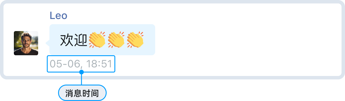
使用示例如下:
// 获取 ChatUIKitMessageListLayout 对象
val chatMessageListLayout:ChatUIKitMessageListLayout? = binding?.layoutChat?.chatMessageListLayout
chatMessageListLayout?.let{
    it.setTimeTextSize(12)  // 设置消息时间文本的字体大小(单位:px )
    it.setTimeTextColor(Color.GRAY) // 设置消息时间文本的颜色
    it.setTimeBackground(ContextCompat.getDrawable(it.context, R.drawable.your_time_bg)) // 设置消息时间的背景
    ...
}
关于设置消息时间的格式以及通过 UIKitChatFragment.Builder 设置消息时间样式,详见 消息列表的基本设置说明。
设置消息状态图标
自定义图标资源
如需自定义消息状态图标,你可在 App 工程中同名覆盖以下 Drawable 资源:
| 状态 | Drawable 资源名 |
|---|---|
| 已发送 | uikit_msg_status_sent |
| 已送达 | uikit_msg_status_received |
| 已读 | uikit_msg_status_read |
图标显示规则
消息已送达和已读图标的显示行为与 SDK 初始化的 ChatOptions 配置有关:
- 已送达图标:当
requireDeliveryAck = true且消息收到送达回执时显示。 - 已读图标:当
requireAck = true且消息收到已读回执时显示。
// SDK 初始化时设置(示例:参考 DemoHelper#initChatOptions)
val options = ChatOptions().apply {
    // 是否需要已读回执
    requireAck = true
    // 是否需要送达回执
    requireDeliveryAck = true
}
ChatUIKitClient.init(context, options)
隐藏状态图标
- 仅隐藏已读/已送达图标:将
requireAck或requireDeliveryAck设为false,则对应状态图标不会显示,但发送成功后仍显示已发送图标。 - 完全隐藏所有发送状态图标(含已发送):需要自定义发送消息的 Row 布局/Row(例如,在 App 工程中同名覆盖各类
uikit_row_sent_*.xml并移除tv_delivered/tv_ack),或提供自定义 Row/ViewHolder 实现。
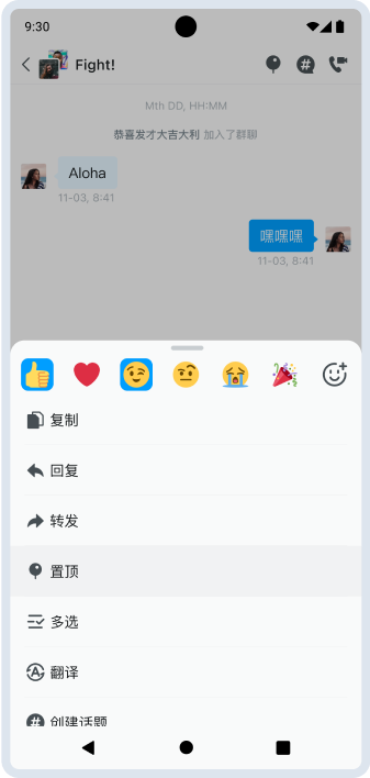
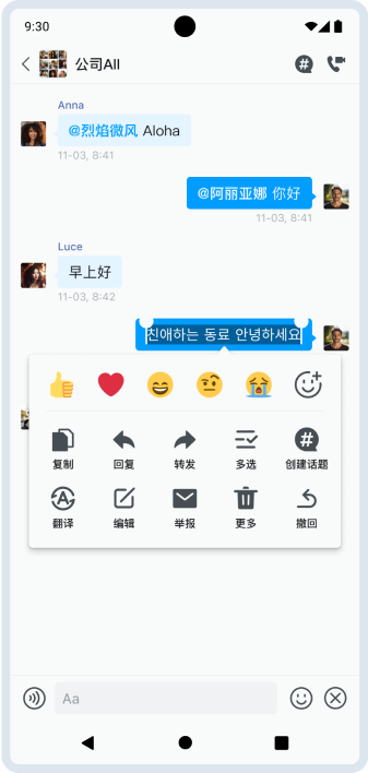
设置长按消息菜单
在消息列表中长按任意消息,可弹出包含复制、回复、转发、置顶、多选、翻译、创建话题等功能的操作菜单。UIKit 支持对菜单样式和内容进行灵活定制,包括菜单背景和菜单项的图标、文字颜色和大小。
关于选择微信样式菜单或仿系统 UIActionSheet 样式,详见 消息列表的基本设置说明。
管理菜单项
ChatUIKitLayout 提供完整的长按菜单项管理能力,如下表所示:
| 方法 | 描述 |
|---|---|
addItemMenu() | 添加新菜单项。 |
clearMenu() | 清除菜单项。 |
findItemVisible() | 设置 itemId 显示或隐藏指定菜单项。 |
setOnMenuChangeListener() | 设置菜单项的点击事件监听,UIKitChatFragment 中已经设置该监听。 |
- 添加新菜单项:
binding?.let {
    it.layoutChat.addItemMenu(menuId, menuOrder, menuTile)
}
- 清除所有菜单项:
binding?.let {
    it.layoutChat.clearMenu()
}
显示或隐藏指定菜单项:
通过指定
itemId设置菜单项的可见性。
binding?.let {
    it.layoutChat.findItemVisible(itemId: Int, visible: Boolean)
}
- 处理菜单事件
UIKitChatFragment 已预设菜单点击监听。自定义 Fragment 继承 UIKitChatFragment 后,可重写以下方法实现监听:
override fun onPreMenu(helper: ChatUIKitChatMenuHelper?, message: ChatMessage?) {
    // 菜单展示前的回调事件,可以通过 helper 对象设置菜单项是否展示。
}

override fun onMenuItemClick(item: ChatUIKitMenuItem?, message: ChatMessage?): Boolean {
    // 菜单项点击事件,设置返回 true 表示拦截该事件。
    return false
}

override fun onDismiss() {
    // 处理快捷菜单的隐藏事件。
}
设置菜单样式
设置菜单背景色
菜单背景颜色同样通过资源覆盖的方式进行自定义:
| 菜单样式 | 背景调整方式 |
|---|---|
| 微信风格(PopupWindow) | 覆盖 drawable/uikit_shape_popup_radius_8 资源,可修改背景色、圆角、描边等样式。 |
| 底部弹窗风格(BottomSheet) | 菜单列表的布局文件位于 res/layout/uikit_dialog_menu.xml 中。若需自定义背景,可在您的 App 工程中覆盖以下样式:- ease_item_menu_top_layout_style- ease_conv_item_menu_list- ease_conv_item_menu_divider- ease_conv_item_menu_cancel |
设置菜单项图标
你可以在 onPreMenu() 中通过 ChatUIKitChatMenuHelper 动态控制菜单项的图标:
| 菜单项 | 默认 ID | 默认图标资源 |
|---|---|---|
| 复制 | R.id.action_chat_copy | uikit_chat_item_menu_copy |
| 删除 | R.id.action_chat_delete | uikit_chat_item_menu_delete |
| 撤回 | R.id.action_chat_recall | uikit_chat_item_menu_unsent |
| 编辑 | R.id.action_chat_edit | uikit_chat_item_menu_edit |
| 回复 | R.id.action_chat_reply | uikit_chat_item_menu_reply |
自定义方式如下:
- 替换图标:修改
resourceId属性,或在 App 工程中同名覆盖默认 drawable。 - 隐藏图标:将
resourceId设置为-1,则隐藏图标,仅显示文字。 - 显示/隐藏:使用
findItemVisible()方法显示或隐藏菜单项。
使用示例如下:
override fun onPreMenu(helper: ChatUIKitChatMenuHelper?, message: ChatMessage?) {
    helper ?: return
    // 隐藏“编辑”菜单项
    helper.findItemVisible(R.id.action_chat_edit, false)

    // 替换“复制”图标
    helper.findItem(R.id.action_chat_copy)?.resourceId = R.drawable.ic_copy_custom

    // “撤回”仅显示文字,不显示图标
    helper.findItem(R.id.action_chat_recall)?.resourceId = -1
}
设置菜单项文字样式
ChatUIKitMenuItem支持通过titleColor设置 文字颜色(同时会作为 icon tint 颜色):
override fun onPreMenu(helper: ChatUIKitChatMenuHelper?, message: ChatMessage?) {
    helper?.findItem(R.id.action_chat_delete)?.titleColor = Color.RED
}
- 根据菜单风格的不同,文字大小的调整方式有所区别:
| 菜单风格 | 调整方式 |
|---|---|
| 微信风格(PopupWindow) | 在 App 工程中同名覆盖 layout/uikit_item_select_text_pop.xml,修改 tv_pop_func 的 android:textSize 属性。 |
| 底部弹窗风格(BottomSheet) | 在 App 工程中同名覆盖以下样式之一: - ease_chat_extend_menu_item_title - ease_chat_extend_menu_horizontal_item_title 调整其中的 textAppearance 或 textSize 属性。(对应布局文件:uikit_chat_menu_item.xml / uikit_chat_menu_item_horizontal.xml) |
完全自定义消息条目
你可以自定义消息条目的内容,即各种消息类型的自定义消息布局。
开发者可以继承 ChatUIKitRow、ChatUIKitRowViewHolder 和 ChatUIKitMessagesAdapter 实现自己的 CustomTypeChatRow、CustomChatTypeViewViewHolder 和 CustomMessageAdapter,然后将 CustomMessageAdapter 设置到 UIKitChatFragment#Builder#setCustomAdapter 中。
- 创建
CustomTypeChatRow,继承自ChatUIKitRow。
class CustomTypeChatRow(
    private val context: Context,
    private val attrs: AttributeSet? = null,
    private val defStyle: Int = 0,
    isSender: Boolean = false
): ChatUIKitRow(context, attrs, defStyle, isSender) {

    override fun onInflateView() {
        inflater.inflate(if (!isSender) R.layout.layout_row_received_custom_type
        else R.layout.layout_row_sent_custom_type,
            this)
    }

    override fun onSetUpView() {
        (message?.getMessage()?.body as? ChatTextMessageBody)?.let { txtBody ->
            contentView.text = txtBody.message
        }
    }
}
- 创建
CustomChatTypeViewViewHolder,继承自ChatUIKitRowViewHolder。
class CustomChatTypeViewViewHolder(
    itemView: View
): ChatUIKitRowViewHolder(itemView) {

    override fun onBubbleClick(message: EaseMessage?) {
        super.onBubbleClick(message)
        // Add click event
    }
}
- 创建自定义适配器
CustomMessageAdapter继承自ChatUIKitMessagesAdapter,重写getItemNotEmptyViewType和getViewHolder方法。
class CustomMessageAdapter: ChatUIKitMessagesAdapter() {

    override fun getItemNotEmptyViewType(position: Int): Int {
        // 根据消息类型设置自己的 itemViewType。
        mData?.get(position)?.getMessage()?.let { msg ->
            msg.getStringAttribute("type", null)?.let { type ->
                if (type == CUSTOM_TYPE) {
                    return if (msg.direct() == ChatMessageDirection.SEND) {
                        VIEW_TYPE_MESSAGE_CUSTOM_VIEW_ME
                    } else {
                        VIEW_TYPE_MESSAGE_CUSTOM_VIEW_OTHER
                    }
                }
            }
        }
        // 如果要使用默认的,返回 super.getItemNotEmptyViewType(position) 即可。
        return super.getItemNotEmptyViewType(position)
    }

    override fun getViewHolder(parent: ViewGroup, viewType: Int): ViewHolder<EaseMessage> {
        // 根据返回的 viewType 返回对应的 ViewHolder。
        if (viewType == VIEW_TYPE_MESSAGE_CUSTOM_VIEW_ME || viewType == VIEW_TYPE_MESSAGE_CUSTOM_VIEW_OTHER) {
            CustomChatTypeViewViewHolder(
                CustomTypeChatRow(parent.context, isSender = viewType == VIEW_TYPE_MESSAGE_CUSTOM_VIEW_ME)
            )
        }
        // 返回自定义的 ViewHolder 或者 使用默认的 super.getViewHolder(parent, viewType)。
        return super.getViewHolder(parent, viewType)
    }

    companion object {
        private const val CUSTOM_TYPE = "custom_type"
        private const val VIEW_TYPE_MESSAGE_CUSTOM_VIEW_ME = 1000
        private const val VIEW_TYPE_MESSAGE_CUSTOM_VIEW_OTHER = 1001
    }
}
- 添加
CustomMessageAdapter到UIKitChatFragment#Builder。
builder.setCustomAdapter(CustomMessageAdapter())
自定义资源
在 App 工程中,可通过放置同名资源(drawable/layout/values)来覆盖 UIKit 默认实现,从而自定义界面与功能。
消息类型和消息操作相关资源
分类 | 资源名称 | 说明 |
通用/默认 | uikit_default_avatar | 默认头像 |
消息气泡容器 | uikit_chat_row_receive_bubble_bg | 接收方气泡背景 |
uikit_chat_row_sent_bubble_bg | 发送方气泡背景 | |
发送状态/失败重发 | uikit_msg_status_sent | 已发送图标 |
uikit_msg_status_received | 已送达图标 | |
uikit_msg_status_read | 已读图标 | |
uikit_msg_state_failed_resend | 发送失败重发图标 | |
图片/视频 | uikit_default_image | 图片占位图 |
uikit_default_video_thumbnail | 视频缩略图占位图 | |
uikit_video_play_btn_small_nor | 视频播放按钮 | |
uikit_chat_row_video_length_bg | 视频时长背景 | |
语音 | uikit_chatfrom_voice_playing | 接收方语音图标/动画 |
uikit_chatto_voice_playing | 发送方语音图标/动画 | |
voice_from_icon | 语音播放帧动画(接收方) | |
voice_to_icon | 语音播放帧动画(发送方) | |
uikit_chat_voice_unread_icon | 语音未读标记 | |
文件 | uikit_chat_row_file_icon | 文件消息图标 |
uikit_chat_row_file_icon_bg | 文件消息图标背景 | |
位置 | uikit_chat_location | 位置图标 |
uikit_chat_row_receive_location_bubble_bg | 接收方位置气泡背景 | |
uikit_chat_row_send_location_bubble_bg | 发送方位置气泡背景 | |
uikit_chat_row_receive_location_content_bg | 接收方位置内容区域背景 | |
uikit_chat_row_send_location_content_bg | 发送方位置内容区域背景 | |
链接预览 | uikit_url_preview_receive_bubble_bg | 接收方链接预览气泡背景 |
uikit_url_preview_sent_bubble_bg | 发送方链接预览气泡背景 | |
引用回复 | uikit_widget_chat_message_reply_background | 引用回复整体背景 |
uikit_chat_row_receive_message_reply_bg | 接收方消息行中的回复背景 | |
uikit_chat_row_send_message_reply_bg | 发送方消息行中的回复背景 | |
uikit_chat_quote_default_image | 引用图片默认占位图 | |
uikit_chat_quote_icon_image | 引用图片图标 | |
uikit_chat_quote_icon_cancel | 取消引用图标 | |
话题/置顶 | uikit_thread_region_bubble | 话题区域气泡背景 |
uikit_chat_item_menu_topic | 话题入口图标 | |
uikit_topic_count_icon | 话题数量图标 | |
uikit_icon_chat_pininfo_light | 置顶图标 | |
多选/转发/合并/未读提示等 | uikit_chat_item_multi_selector | 多选态条目背景 |
uikit_icon_combine | 合并消息图标 | |
uikit_shape_message_forward_tab_layout_indicator | 转发/合并等页面标签指示器 | |
uikit_chat_forward_btn_bg_selector | 转发按钮背景 | |
uikit_icon_down_arrow | 未读提示下拉箭头 | |
uikit_title_menu | 标题/菜单图标(部分消息组件使用) | |
消息编辑 | uikit_chat_message_edit_root_bg | 编辑弹窗根背景 |
uikit_chat_message_edit_button_selector | 编辑弹窗按钮背景
|
消息菜单相关资源
分类 | 资源名称 | 说明 |
长按消息菜单(微信样式 PopupWindow) | uikit_shape_popup_radius_8 | 菜单容器背景:圆角/背景色/描边 |
uikit_ic_arrow | 气泡箭头 | |
菜单项默认图标 | uikit_chat_item_menu_copy | 复制菜单图标 |
uikit_chat_item_menu_reply | 回复菜单图标 | |
uikit_chat_item_menu_unsent | 撤回菜单图标 | |
uikit_chat_item_menu_edit | 编辑菜单图标 | |
uikit_chat_item_menu_delete | 删除菜单图标 | |
uikit_chat_item_menu_report | 举报菜单图标 | |
uikit_chat_item_menu_translation | 翻译菜单图标 | |
uikit_chat_item_menu_forward | 转发菜单图标 | |
uikit_chat_item_menu_multi | 多选菜单图标 | |
uikit_chat_item_menu_topic | 话题菜单图标 | |
uikit_chat_item_menu_location | 位置菜单图标 | |
Reaction(表情回复) | uikit_chat_message_menu_reaction_item_bg_selector | 表情菜单项背景选择器 |
uikit_chat_message_reaction_item_bg_selector | 消息气泡下方 Reaction 气泡背景选择器 | |
uikit_chat_message_reaction_tab_item_bg_selector | 更多表情 tab Item 背景选择器 | |
uikit_chat_emoji_item_bg_selector | 更多表情面板 Item 背景选择器 | |
uikit_chat_emoji_delete_button_bg | 表情删除按钮背景 | |
uikit_chat_emoji_pager_send_btn_selector | 表情面板发送按钮背景选择器 |
提示
同名覆盖属于“资源层替换”,适合做 UI 资源替换与结构调整。如果你需要基于消息类型做更强的业务逻辑控制,建议通过自定义 Row/ViewHolder(自定义 ChatUIKitMessagesAdapter / ChatUIKitViewHolderFactory)实现。
可重写方法标记
标记为 open / override fun的方法均可被子类重写方法。如有需要,可重写对应方法实现自己业务逻辑。