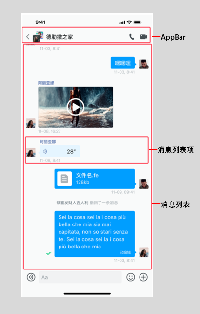
消息列表的高级设置
消息列表的高级设置
消息列表是聊天界面的核心组件,基于 MessageListView 实现。本文介绍如何通过 MessagesViewController 实现消息列表的高级设置。
概述
你可以通过 MessagesViewController 设置消息列表:
final controller = MessagesViewController(profile: profile);

// 设置消息列表的各种属性
controller.msgModelList; // 消息列表数据
controller.userMap; // 用户信息缓存
controller.selectedMessages; // 选中的消息
controller.isMultiSelectMode; // 是否多选模式
MessagesViewController 提供如下方法:
| 方法 | 描述 |
|---|---|
sendMessage() | 发送消息 |
resendMessage() | 重新发送消息 |
recallMessage() | 撤回消息 |
deleteMessage() | 删除消息 |
translateMessage() | 翻译消息 |
pinMessage() | 置顶消息 |
unpinMessage() | 取消置顶 |
clearMessages() | 清空消息列表 |
fetchItemList() | 获取历史消息 |
refresh() | 刷新消息列表 |
设置头像和昵称
你可以通过 MessagesView 的参数设置头像和昵称。
关于使用自己的头像和昵称,详见 用户自定义信息文档中的介绍。
MessagesView(
  profile: profile,
  showMessageItemAvatar: true,  // 是否显示头像:(默认)true:显示; false: 隐藏。
  showMessageItemNickname: false, // 是否显示昵称:true:显示;(默认) false: 隐藏。
)
设置消息气泡
你可以通过 bubbleBuilder 设置消息气泡。
MessagesView(
  profile: profile,
  bubbleBuilder: (context, message, isLeft) {
    // 自定义气泡样式
    return Container(
      decoration: BoxDecoration(
        color: isLeft
            ? Colors.grey[200]
            : Colors.blue,
        borderRadius: BorderRadius.circular(12),
      ),
      padding: EdgeInsets.all(12),
      child: Text(message.textContent ?? ''),
    );
  },
)

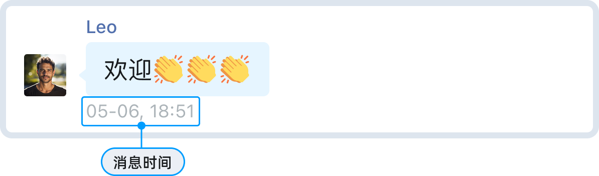
设置消息时间样式
你可以通过以下两种方式设置消息时间样式:
MessageListView提供通过主题配置进行设置:
ChatUIKitTheme.instance.font.bodySmall.copyWith(
  fontSize: 12,
  color: Colors.grey[600],
);
- 通过自定义时间格式化器设置:
ChatUIKitTimeFormatter.instance.formatterHandler = (
  BuildContext context,
  ChatUIKitTimeType type,
  int timestamp,
) {
  final date = DateTime.fromMillisecondsSinceEpoch(timestamp);
  if (type == ChatUIKitTimeType.message) {
    return '${date.hour}:${date.minute.toString().padLeft(2, '0')}';
  }
  return null;
};
设置消息状态图标
自定义图标资源
消息状态图标(如“已发送”、“已送达”、“已读”)内置为主题配置项。
如需替换为自定义图标,可在应用工程中直接覆盖对应资源。
消息状态显示规则
消息送达与已读图标的显示,取决于 SDK 初始化时 Options 的配置:
- 已送达图标:当
requireDeliveryAck = true且消息收到送达回执时显示。 - 已读图标:当
requireAck = true且消息收到已读回执时显示。
// SDK 初始化配置示例
await ChatUIKit.instance.init(
  options: Options.withAppKey(
    appKey,
    requireAck: true, // 是否需要已读回执
    requireDeliveryAck: true, // 是否需要送达回执
  ),
);
隐藏状态图标
根据需求选择以下方式:
- 仅隐藏已读/已送达图标:将
requireAck或requireDeliveryAck设为false,则对应状态图标不会显示,但发送成功后仍会显示已发送图标。 - 完全隐藏所有发送状态图标(含已发送):需要自定义消息气泡,通过
bubbleBuilder自定义实现。
设置长按消息菜单
在消息列表中长按任意消息,可弹出包含复制、回复、转发、置顶、多选、翻译、创建话题等功能的操作菜单。UIKit 支持对菜单样式和内容进行灵活定制,包括菜单背景和菜单项的图标、文字颜色和大小。
关于选择微信样式菜单或仿系统 bottomSheet 样式,详见 消息列表的基本设置说明。
管理菜单项
通过 onItemLongPressHandler 回调对菜单项进行修改、添加或删除。该回调会传入默认菜单项列表,你可以修改后返回。
typedef MessagesViewItemLongPressPositionHandler = List<ChatUIKitEventAction>? Function(
  BuildContext context,
  MessageModel model,
  Rect rect,
  List<ChatUIKitEventAction> items,
);
- 添加新菜单项:
MessagesView(
  profile: profile,
  onItemLongPressHandler: (context, model, rect, items) {
    // 添加自定义菜单项
    items.add(
      ChatUIKitEventAction.normal(
        actionType: ChatUIKitActionType.custom,
        label: '自定义操作',
        icon: Icon(Icons.star),
        onTap: () {
          // 处理点击事件
        },
      ),
    );
    return items;
  },
)
- 清除所有菜单项:
MessagesView(
  profile: profile,
  onItemLongPressHandler: (context, model, rect, items) {
    // 返回空列表清除所有菜单项
    return [];
  },
)
- 显示或隐藏指定菜单项:
MessagesView(
  profile: profile,
  onItemLongPressHandler: (context, model, rect, items) {
    // 过滤掉不需要的菜单项
    items.removeWhere((item) =>
      item.actionType == ChatUIKitActionType.edit
    );
    return items;
  },
)
- 修改菜单项:
MessagesView(
  profile: profile,
  onItemLongPressHandler: (context, model, rect, items) {
    // 修改现有菜单项
    for (var item in items) {
      if (item.actionType == ChatUIKitActionType.delete) {
        // 修改删除菜单项的样式
        item.style = TextStyle(color: Colors.red);
      }
    }
    return items;
  },
)
自定义菜单样式
设置菜单背景色
通过主题配置全局定义菜单背景色:
ChatUIKitTheme.instance.color.neutralColor98; // 菜单背景色
设置菜单项图标
UIKit 预置了以下菜单项类型,可通过 actionType 进行识别和操作:
| 菜单项 | 默认 ActionType | 说明 |
|---|---|---|
| 复制 | ChatUIKitActionType.copy | 文本消息复制 |
| 删除 | ChatUIKitActionType.delete | 删除消息 |
| 撤回 | ChatUIKitActionType.recall | 撤回消息 |
| 编辑 | ChatUIKitActionType.edit | 编辑消息 |
| 回复 | ChatUIKitActionType.reply | 回复消息 |
| 转发 | ChatUIKitActionType.forward | 转发消息 |
| 多选 | ChatUIKitActionType.multiSelect | 多选消息 |
| 置顶 | ChatUIKitActionType.pinMessage | 置顶消息 |
| 翻译 | ChatUIKitActionType.translate | 翻译消息 |
| 话题 | ChatUIKitActionType.thread | 创建话题 |
| 举报 | ChatUIKitActionType.report | 举报消息 |
在 onItemLongPressHandler 中动态控制菜单项的图标:
- 替换图标:修改菜单项的
icon属性。
MessagesView(
  profile: profile,
  onItemLongPressHandler: (context, model, rect, items) {
    for (var item in items) {
      if (item.actionType == ChatUIKitActionType.copy) {
        // 替换复制图标
        item.icon = Icon(Icons.content_copy, color: Colors.blue);
      }
    }
    return items;
  },
)
- 隐藏图标:将菜单项的
icon设为null,菜单项将仅显示文字,隐藏图标。
MessagesView(
  profile: profile,
  onItemLongPressHandler: (context, model, rect, items) {
    for (var item in items) {
      if (item.actionType == ChatUIKitActionType.delete) {
        item.icon = null; // 隐藏图标
      }
    }
    return items;
  },
)
- 显示/隐藏菜单项:使用
onItemLongPressHandler方法添加或移除菜单项。
设置菜单项文字样式
通过修改 ChatUIKitEventAction 对象的 style 属性,可自定义菜单项的文字颜色、大小等样式。
- 统一设置:遍历所有菜单项应用相同样式。
MessagesView(
  profile: profile,
  onItemLongPressHandler: (context, model, rect, items) {
    for (var item in items) {
      // 设置菜单项文字样式
      item.style = TextStyle(
        fontSize: 14,
        color: Colors.black87,
        fontWeight: FontWeight.w500,
      );
    }
    return items;
  },
)
- 差异化设置:根据
actionType为特定菜单项设置样式。
MessagesView(
  profile: profile,
  onItemLongPressHandler: (context, model, rect, items) {
    for (var item in items) {
      if (item.actionType == ChatUIKitActionType.delete) {
        // “删除”菜单项使用红色文字
        item.style = TextStyle(
          fontSize: 14,
          color: Colors.red,
          fontWeight: FontWeight.w500,
        );
      }
    }
    return items;
  },
)
完全自定义消息条目
你可通过自定义布局,实现不同消息类型的个性化展示。
利用 itemBuilder 参数可自定义消息条目。该参数类型为 MessageItemBuilder,其定义为:
typedef MessageItemBuilder = Widget? Function(
    BuildContext context,
    MessageModel model
);
如果 itemBuilder 返回 null,消息将使用默认的 ChatUIKitMessageListViewMessageItem 进行渲染。
- 自定义内容布局
以下示例展示了如何为特定自定义消息类型渲染定制内容:
MessagesView(
  profile: profile,
  itemBuilder: (context, model) {
    // 根据消息类型返回自定义 Widget
    if (model.message.bodyType == MessageType.CUSTOM) {
      // 检查是否是自定义消息类型
      final customBody = model.message.body as CustomMessageBody;
      if (customBody.event == 'custom_type') {
        // 返回自定义 Widget
        return Container(
          padding: EdgeInsets.all(12),
          decoration: BoxDecoration(
            color: Colors.blue[100],
            borderRadius: BorderRadius.circular(8),
          ),
          child: Column(
            crossAxisAlignment: CrossAxisAlignment.start,
            children: [
              Text(
                '自定义消息',
                style: TextStyle(fontWeight: FontWeight.bold),
              ),
              SizedBox(height: 4),
              Text(customBody.params?['content'] ?? ''),
            ],
          ),
        );
      }
    }
    // 返回 null 使用默认渲染
    return null;
  },
)
- 完全自定义消息项
若需完全自定义消息项的布局(包括头像、昵称等),可返回一个完整的 Widget:
MessagesView(
  profile: profile,
  itemBuilder: (context, model) {
    if (model.message.bodyType == MessageType.CUSTOM) {
      final customBody = model.message.body as CustomMessageBody;
      if (customBody.event == 'custom_type') {
        // 返回完整的自定义消息项 Widget
        return Row(
          mainAxisAlignment: model.message.direction == MessageDirection.SEND
              ? MainAxisAlignment.end
              : MainAxisAlignment.start,
          children: [
            if (model.message.direction == MessageDirection.RECEIVE)
              ChatUIKitAvatar(
                size: 32,
                avatarUrl: ChatUIKitProvider.instance
                    .getProfileById(model.message.from!)?.avatarUrl,
              ),
            SizedBox(width: 8),
            Container(
              padding: EdgeInsets.all(12),
              decoration: BoxDecoration(
                color: Colors.blue[100],
                borderRadius: BorderRadius.circular(8),
              ),
              child: Text('自定义消息内容'),
            ),
          ],
        );
      }
    }
    return null;
  },
)
自定义资源
在 Flutter 中,可通过主题配置或自定义 Widget 覆盖 UIKit 默认实现,从而自定义界面与功能。
消息类型和消息操作相关的资源设置如下表所示:
| 分类 | 资源/配置 | 说明 |
|---|---|---|
| 通用/默认 | ChatUIKitTheme.instance.color | 默认颜色配置 |
| 消息气泡容器 | bubbleBuilder | 自定义气泡样式 |
| 发送状态/失败重发 | ChatUIKitTheme | 状态图标配置 |
| 图片/视频 | itemBuilder | 自定义图片/视频消息 |
| 语音 | itemBuilder | 自定义语音消息 |
| 文件 | itemBuilder | 自定义文件消息 |
| 位置 | itemBuilder | 自定义位置消息 |
| 链接预览 | itemBuilder | 自定义链接预览 |
| 引用回复 | quoteBuilder | 自定义引用回复样式 |
| 话题/置顶 | threadItemBuilder | 自定义话题项 |
| 多选/转发/合并 | multiSelectBottomBar | 自定义多选工具栏 |
提示
通过 itemBuilder、bubbleBuilder 等构建器可以实现完全自定义的消息样式。如果你需要基于消息类型做更强的业务逻辑控制,建议通过自定义构建器实现。